


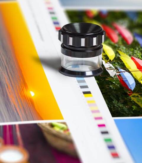


Your company’s logo is more important than you might think. It plays an important emotional role in influencing decision making, especially when information or time is limited. Recognizable logos can actually trigger responses in the same part of your brain that control relational emotions. We’re going to go over the color and shape of your logo.
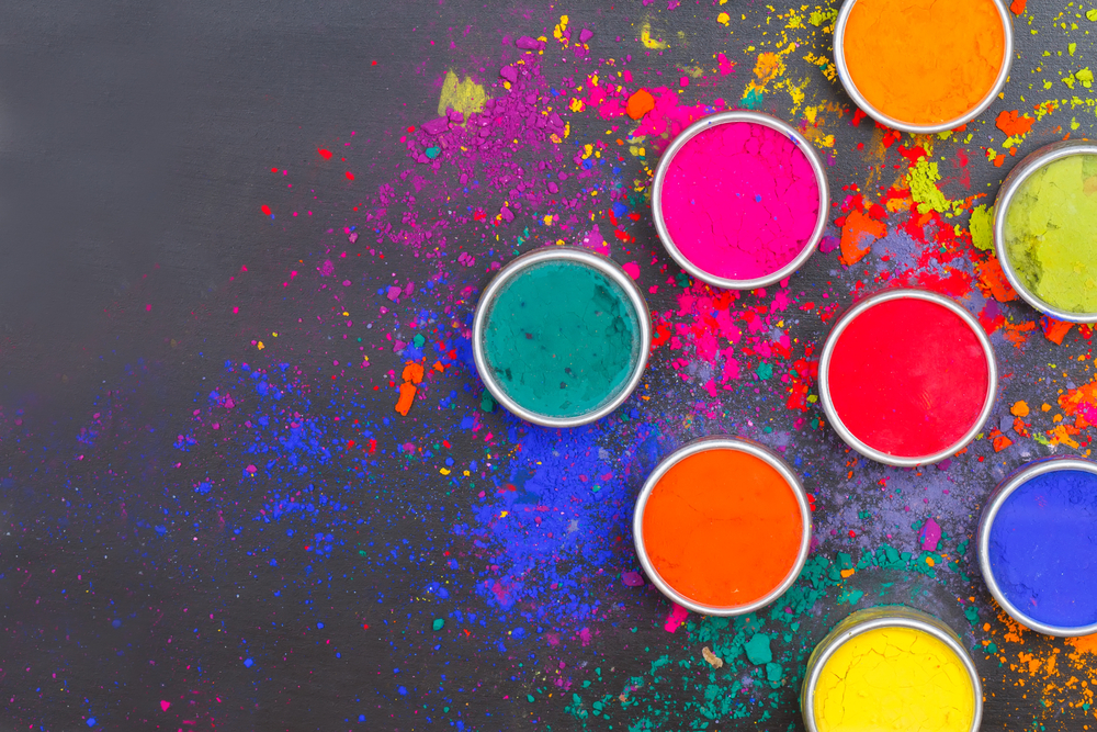
Let’s talk color, the colors you choose are important! Color increases your brand recognition and can also connect with your audience on an emotional level. Now there is no way to ensure you choose the “right” colors for your website and your brand but you should understand all the different messages you can send just through your colors. Colors can be broken down into three categories; cool, warm, and neutral.
Cool colors tend to have a calming effect for your viewer. Every color has negative attributes associated with them as well. Used alone they could have a cold or impersonal feel, so when choosing cool colors it may be wise to add color from another group to avoid this add warmth to your pallet.
- Blue- tranquility, love, loyalty, security, trust, intelligence or coldness, fear, masculinity
- Green- money, growth, fertility, freshness, healing or envy, jealousy, guilt
- Purple- royalty, nobility, spirituality, luxury, ambition or mystery, moodiness
- Turquoise- spiritual, healing, protection, sophisticated or envy, femininity
- Silver- glamorous, high tech, graceful, sleek or dreamer, insincere
Warm colors have an exciting effect on your viewers. Again all colors have negative connotations along with good ones. When these colors are used alone they can over stimulate, generating emotions of anger and violence. When choosing warm tones, adding either cool or neutral colors can help balance it out.
- Red- love, energy, power, strength, passion, heat or anger, danger, warning
- Pink- healthy, happy, feminine, compassion, sweet, playful or weak, femininity, immaturity
- Yellow- bright, energy, sun, creativity, intellect, happy or irresponsible, unstable
- Orange- courage, confidence, friendliness, success or ignorance, sluggishness
- Gold- wealthy, prosperity, valuable, traditional or greed, dreamer
Neutral colors mixed with the cool or warm palettes are preferred. They are great for backgrounds in designs, and tend to tone down the use of other bold colors.
- Brown- friendly, earth, outdoors, longevity, consecutive or dogmatic, conservative
- Beige/Tan- dependable, flexible, crisp, conservative or dull, boring, conservative
- Gray- security, reliability, intelligence, solid, or gloomy, sad, conservative
- Black- protection, dramatic, classy, formality or death, evil, mystery
- White- goodness, innocence, purity, fresh, easy, clean, or winter, cold, distance
The shape of your logo makes our subconscious respond in different ways. Circles, lines, curves, all imply different meanings. Circles, ovals, and ellipses tend to project more positive messages like community, friendship, love relationships or unity. Straight edged logo shapes such as squares and triangles suggest a more stable and balanced messages. Triangles might have an association with power, science, religions, science, or law. Our minds tend to associate vertical lines with masculinity, strength, and aggression but horizontal lines suggest community, tranquility, and calmness. Keep these in mind when choosing your fonts as well!
So if you’re thinking of a rebrand, keep these things in mind!