


You’ve worked hard to choose specific colors for your brand. So it’s natural that you expect your printed materials match that. When a proof of a mailer comes in and you view it on your phone, what looks black on your phone could actually be green. What you see on the computer screen could print out on your t-shirt as a different color. We want your finished product to exceed your expectations, so here’s a little information to ensure you have all the proper tools for your pieces to print consistently with your brand across all mediums.
PMS vs. CMYK
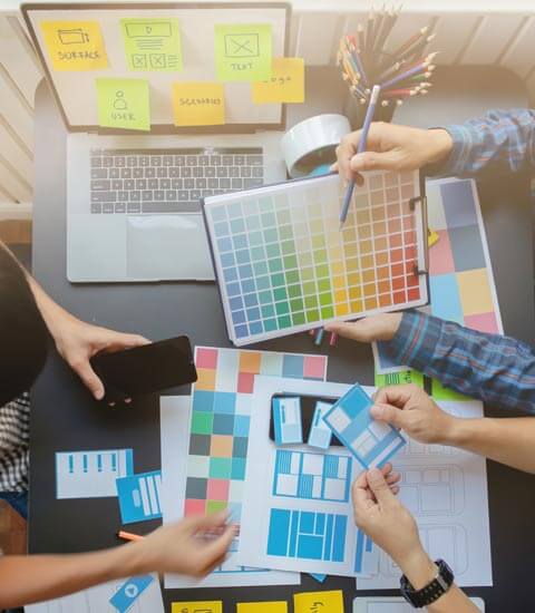
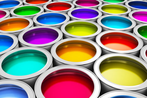
Your brand is likely designed with colors in the Pantone Matching System(PMS) or CMYK. PMS is a standardized color key that is universally used to keep colors consistent. It helps designers, marketers, and printers ensure your colors are brand accurate across all printed mediums. Each color is a finite formula that is identified by a name or number so that everyone involved in each aspect of your project is using the same exact color formula.
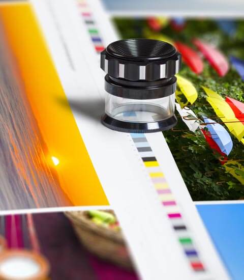
Some projects are printed as what’s called “Four Color Process”. This process uses four inks: cyan, magenta, yellow, and black, otherwise known as CMYK. These four inks can be mixed together in certain percentages to mimic your PMS Color. Because you are not using the same Pantone formula, the conversion from PMS to CMYK is not always an exact match. Rather, this mixture of colors is to get very close to your PMS value.
Non-Traditional Printing
In addition to traditional printing, you have to consider color matching on wearables like embroidery, screen printing, and promotional pieces. On each of these items, the color can look different. For example, in embroidery, not all Pantone colors have an exact PMS thread colors available. But there are many colors available that we can get close to your branded color. In screen printing and promotional printing, the inks can look different than expected based on the color of material you are printing them to – it’s goes back to the science of light reflection and refraction. PMD will anticipate those conditions and suggest colors that will be close to your brand expectations.
Proofing on Screen
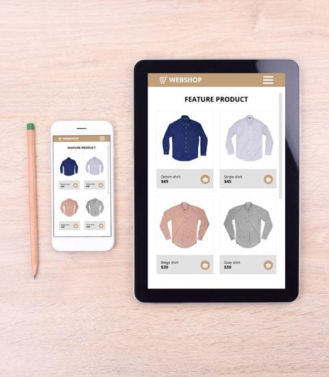
When choosing colors, it’s also important to remember that your computer screen, tablet, or smartphone might show the colors in a different way than will be printed. Your computer or other monitor has more of a blue tone while your paper is more of a red-yellow tone. Each device shows it differently, so take that into account when viewing proofs on a tablet or smartphone. In addition, your computer screen displays the images in RGB while the offset press will be printing in CMYK or PMS, so there could be some color variation between what you see on the screen and the final printed product. But we will strive to meet your color expectations and communicate if we see potential differences.
We understand all these variables and how they affect your final product. If you have any concerns about your colors, be sure to voice it to your marketing representative at PMD and we be happy to answer any questions you may have.